
有没有感觉终端的字体锯齿感觉非常强?
经过搜索后发现可以平滑字体显示得更漂亮一点:
System Settings > Application Appearance > Fonts I enabled anti-aliasing and set Use sub-pixel rendering to RGB and Hinting style to Slight. On the Advanced tab of Desktop Effects I set the scale method to Crisp.
A couple of days ago I changed all my fonts from Ubuntu to DejaVu and to improve the appearance of Konsole I changed the font to DejaVu Sans Mono 9.5
http://ubuntuforums.org/showthread.php?t=1757266&p=10810017#post10810017
关于字体:
可以选择 Droid Sans Mono 或 Ubuntu Mono,这两个字体相对好看,(我选择的Ubuntu Mono)
也可以编译 ~/.kde/share/apps/konsole/Shell.profile,把Fonts字段修改成使用文泉驿微米黑:
Font=WenQuanYi Micro Hei Mono,9,-1,5,50,0,0,0,0,0
关于背景:
背景使用“软色暗底”或“Linux颜色”,我选择的是Linux颜色
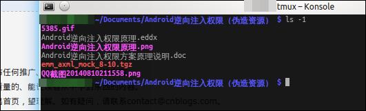
效果展示:
很简单的在Ubuntu系统下安装字体和切换默认字体的方法:http://www.linuxdiyf.com/linux/16653.html
在Ubuntu 14.04 64bit上安装字体管理器font-manager:http://www.linuxdiyf.com/linux/13938.html
Ubuntu 15.04/14.10/14.04下安装字体编辑器Birdfont 2.6:http://www.linuxdiyf.com/linux/11713.html
在ubuntu 15.04下安装字体及设置字体:http://www.linuxdiyf.com/linux/11653.html
如何给CentOS安装字体库:http://www.linuxdiyf.com/linux/13688.html